Market Movers · Consumer mobile · Sep – Oct 2025
Making a collector’s app easier to search and navigate
Independently led, end-to-end usability study of a price-tracking app for trading-card collectors, run ahead of a major redesign.
- Problem
- Before a major redesign, the team needed to know which frequently used features were hard to navigate, and which ones users valued most.
- My role
- Independent consultant and lead researcher; scoped the study with the design team.
- Methods
- 12-task moderated usability test, think-aloud, task metrics, expectation vs. experience ratings, SUS, pre/post interviews; synthesis in Condens.
- Outcome
- Findings informed the launched redesign of search, navigation, and in-app feature guidance.
Context
Market Movers helps trading-card collectors track sales and prices for cards and sealed product. Its users range from casual collectors to frequent buyers and sellers who rely on it to price items quickly. With a major redesign planned, the team wanted to see how both groups actually moved through the app before deciding what to change.
Approach
I ran in-person moderated sessions with 6 participants, all employees of a local card shop: 3 frequent users of the app and 3 novices. I chose the 12 tasks with the designers so they reflected real use. Before each task, participants rated how hard they expected it to be; after it, how hard it actually was. Plotting the two shows where the app breaks a user’s mental model: tasks that should be easy but aren’t. Think-aloud filled in the why, and task metrics measured success, errors, and time on each task.
Study plan
- Pre-test interview6 open-ended questions
App habits, competing tools, and what participants wanted from a redesign.Why: gave context for frequent users and showed what novices expected.
- Think-aloud tasks12 tasks, in person, recorded
Success, errors, and time on task, with expectation and experience ratings around each task.Why: shows not just what users do, but why, and where perceived difficulty diverged from actual difficulty.
- Post-test interview and SUS8 questions plus System Usability Scale
Overall impressions, friction points, and feature-level feedback.Why: a standard usability benchmark, plus explanations behind the ratings.
- Synthesis and reportCondens
Synthesized session notes, then delivered a report to the Market Movers team with prioritized findings, recommendations, and task performance data.
Findings
Participants trusted the data, but search and navigation got in the way.
I grouped issues by priority and paired each one with a recommendation.
Prioritized issues
- 1Two searches share one bar High
Half of participants took around two minutes to find a card profile because they were in, or were automatically switched to, the Sales History tab without noticing. Participants consistently rated search as harder than they expected.
Recommendation: Separate the card search from the sales history search, and explain what each tab does.
Session clip (2× speed): with no card profile showing, the search switches to Sales History, and the participant can’t narrow it to the specific card. - 2The switch from cards to sealed boxes was hard to find High
Two participants couldn’t complete the task, and half took over two minutes. Novices and frequent users were equally confused, and half looked for the switch in Filters first.
Recommendation: Add the switch to Filters, in addition to its current location.
Session clip (2× speed): a participant searches for the cards-to-sealed switch, then gives up on the task. Session clip (1.5× speed): another participant concludes, “I don’t think that I can filter for sealed products.” - 3Key features weren’t self-explanatory Medium
Participants weren’t sure what Intelligence Reports, Deals, and Market Pulse showed or how their numbers were calculated.
Recommendation: Add short in-app explanations, such as a “?” button for each feature.
- 4Smaller details Low
One shortcut was mistaken for sales history or live auctions, and chart lines were hard to tell apart when comparing cards.
Recommendation: Clarify the shortcut, and use more distinct colors or line styles that work for all vision abilities.
What participants wanted
- More complete sales data. When known sales were missing, participants trusted the numbers less.
- More forgiving search. Searching by common nicknames and abbreviations (like “ETB” for elite trainer box), better spell check, and faster search by certification number or scanner.
- Better support for trading card game collectors. The three novices were mainly trading card game collectors and still relied on another application for those prices.
What worked
- Long sales history. Participants valued having more sales history than other apps and websites offer.
- Trusted pricing for sealed product. Participants used the app as a go-to source for pricing sealed boxes.
- Card profiles and collections. Profiles were easy to read, with helpful dropdowns for variants and grades, and collections were simple to build.
See selected task performance data
6 participants: 3 frequent users and 3 novices.
| Task | Avg. errors | Avg. time (s) | Success |
|---|---|---|---|
| 1 · Search for a specific card | 1.17 | 86 | 50% |
| 2 · Identify recent sales | 0 | 16 | 100% |
| 3 · Grade comparison for a single card | 0.33 | 28 | 100% |
| 8 · Determine average prices across timeframes | 0.33 | 57 | 83% |
| 10 · Search current auctions and sales | 0.83 | 23 | 83% |
| 12 · Switch from cards to sealed boxes | 3.00 | 105 | 67% |
Expected vs. actual difficulty for the two hardest tasks (1 = very easy, 5 = very difficult)
| Task | Group | Expected | Actual |
|---|---|---|---|
| 1 · Search for a specific card | Novices | 1.33 | 3.17 |
| Frequent users | 1.67 | 2.33 | |
| 12 · Switch from cards to sealed boxes | Novices | 1.33 | 2.67 |
| Frequent users | 2.33 | 3.67 |
Overall: System Usability Scale score of 65.4 (68 is average); average likelihood to recommend of 6.9 out of 10.
Outcome
The team launched a redesigned app after the study. Several changes lined up with my findings.
- 1Separate, more forgiving search
Addresses issue 1 and two participant requests: more forgiving search and better support for trading card game collectors.
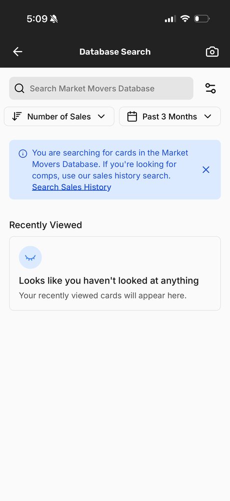
Searches separatedCard search and sales history are now distinct, with a banner explaining which is which. 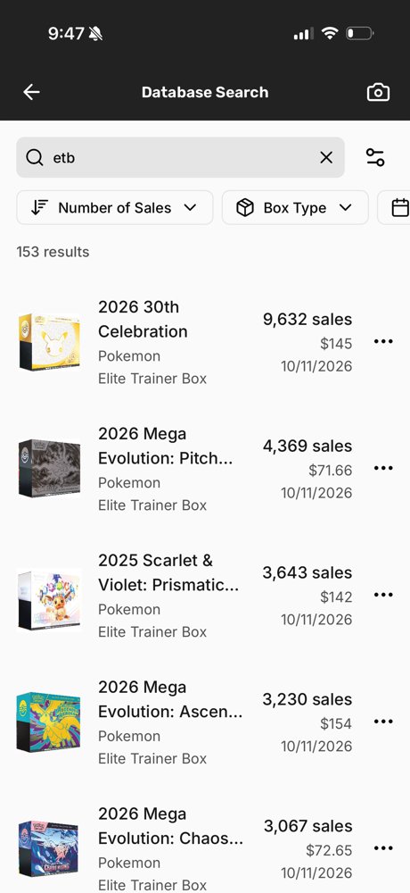
Abbreviations recognizedSearching “etb” now returns elite trainer boxes. 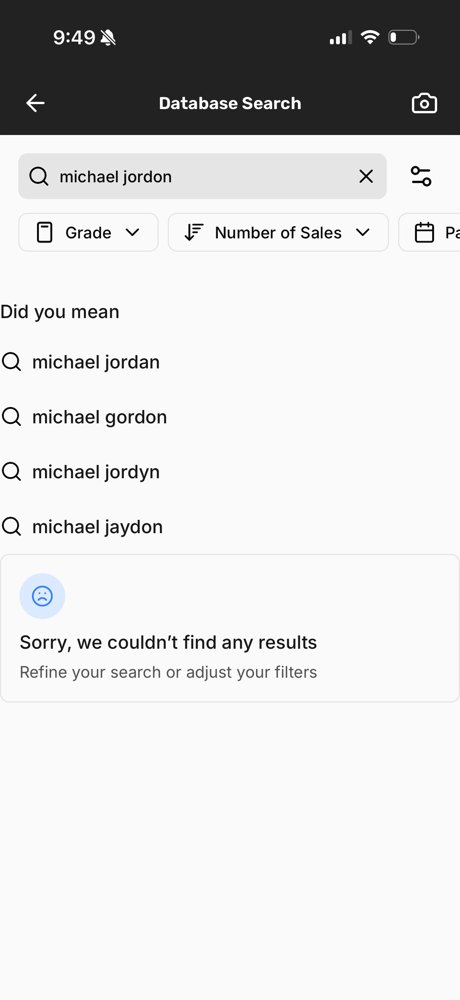
Spelling suggestionsA misspelled name now offers “Did you mean” suggestions. 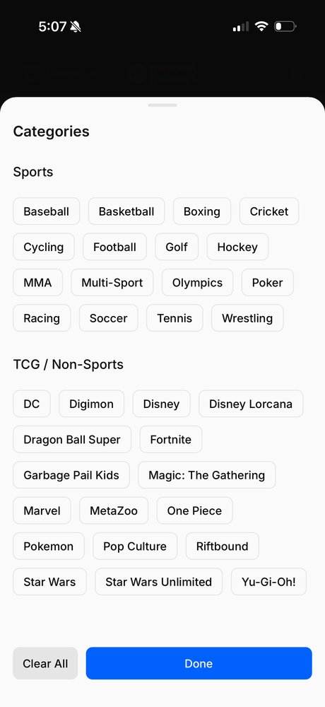
Trading card game filtersA new Categories filter lets trading card game collectors search by game, a completely new feature. - 2A clear switch from cards to sealed boxes
Addresses issue 2.
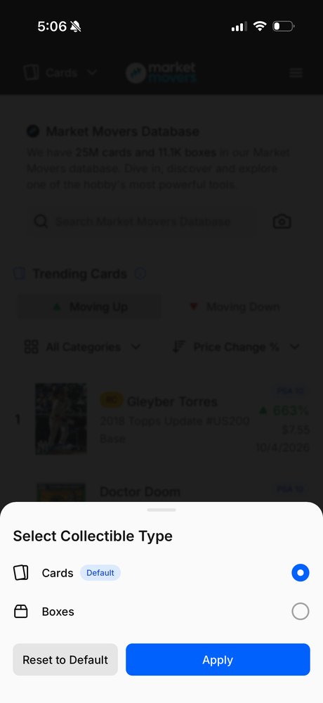
Cards or boxes, one tapA toggle at the top of the app now opens a choice window between cards and boxes. - 3Features explained in the app
Addresses issue 3.
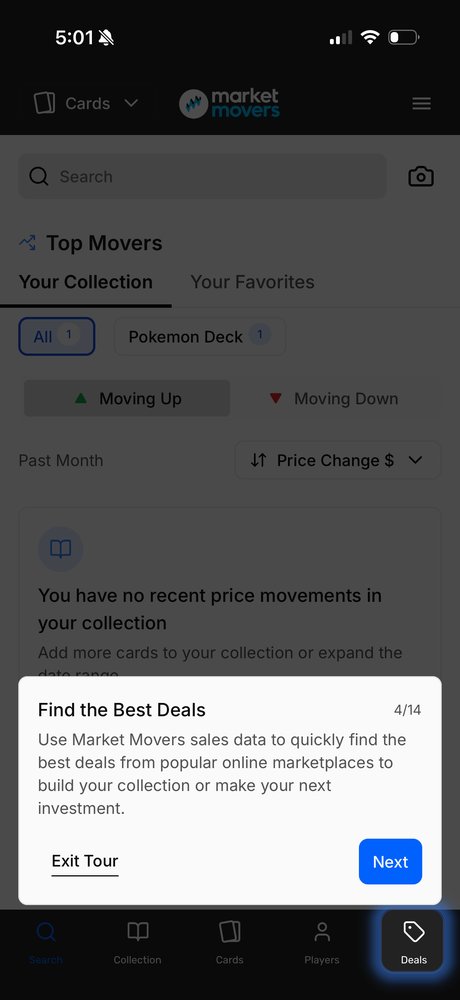
Features explainedAn in-app tour explains Deals, Indexes, and more.
Reflection
What I took from it: On the hardest task, frequent users struggled as much as novices, and rated it even harder. Experienced users often rely on habits they no longer think about, so when the app didn’t work the way they expected, the difficulty stood out even more. Comparing the two groups separated problems that come from being new to the app from problems built into the design itself: if experienced users still struggle, practice won’t fix it. Familiarity can hide friction without removing it.